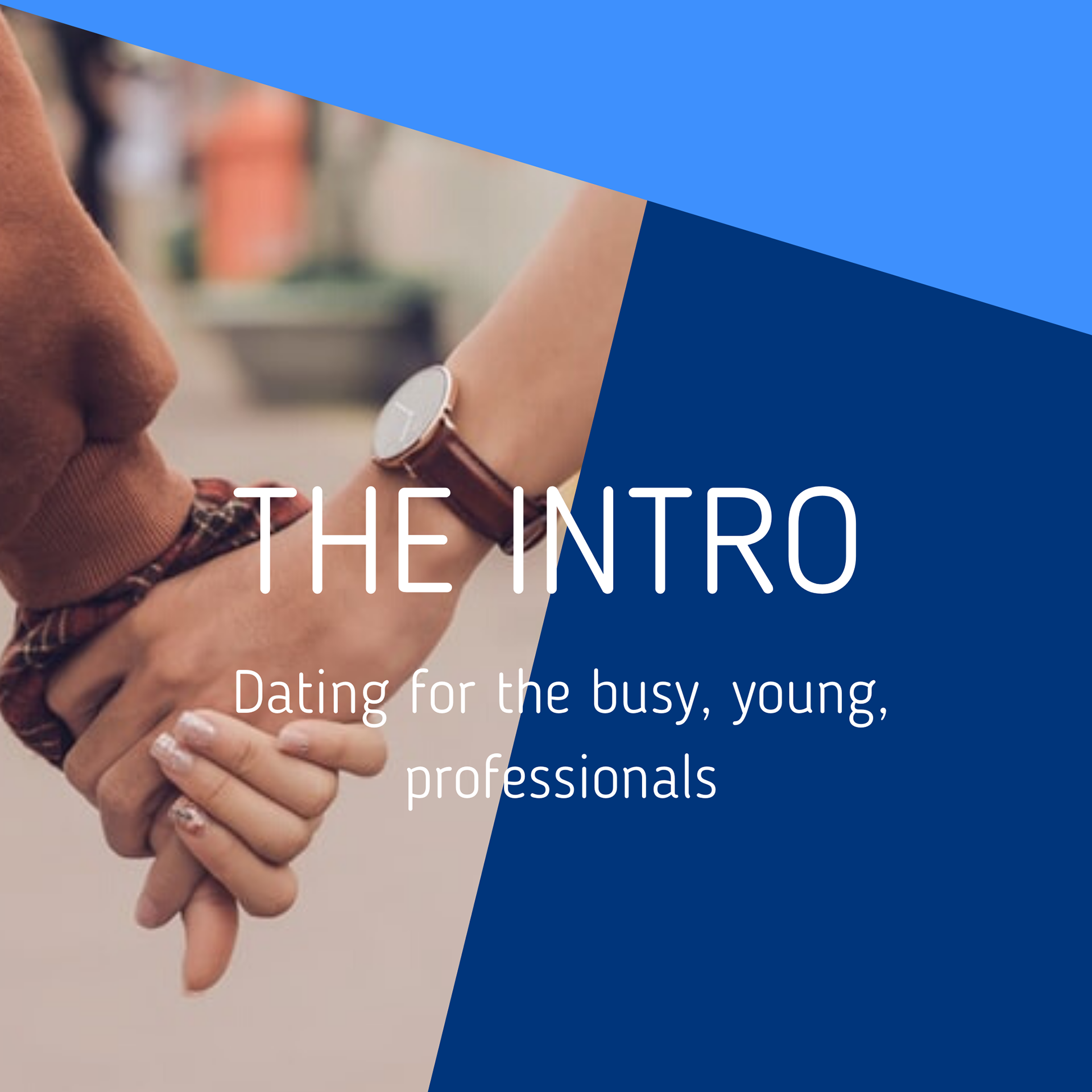
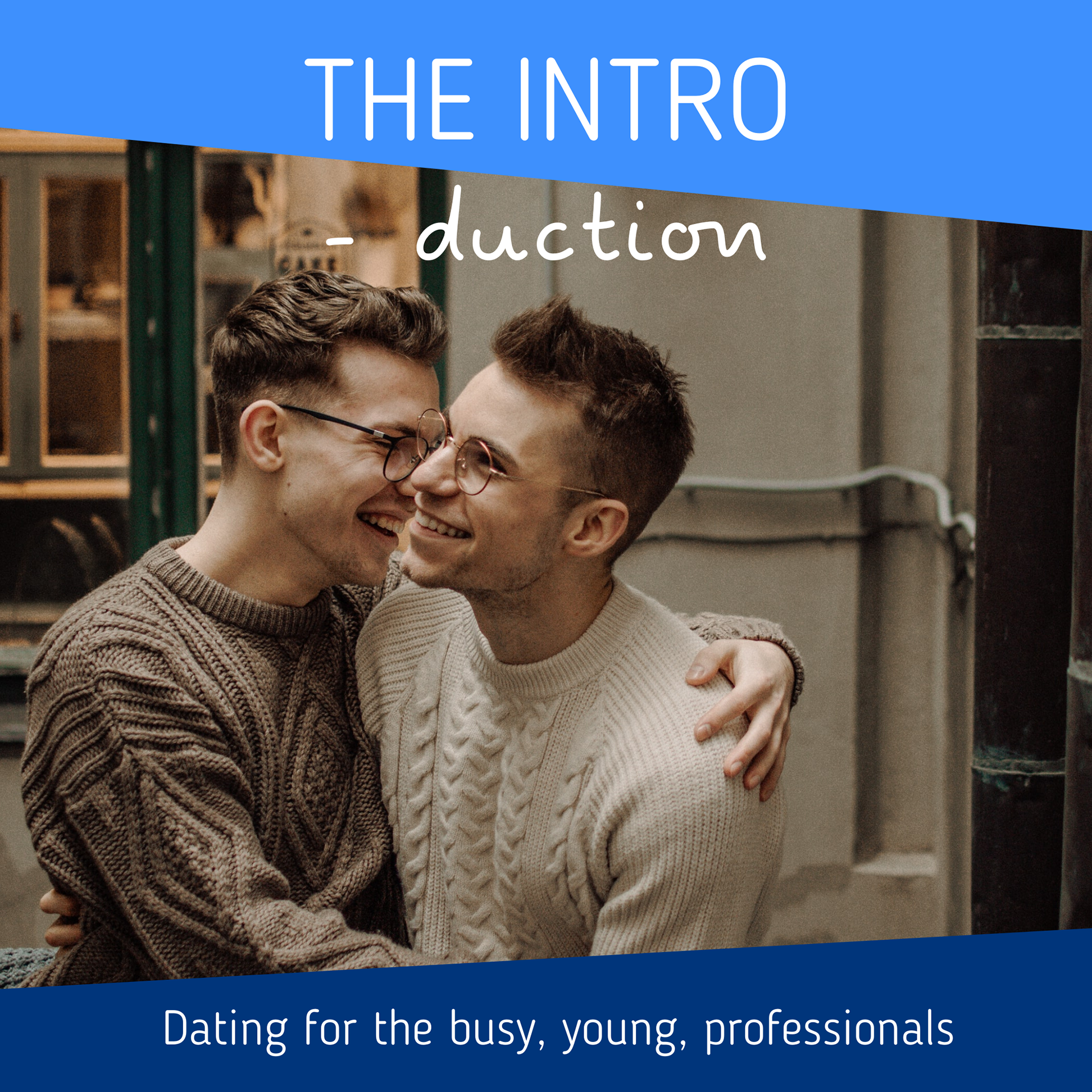
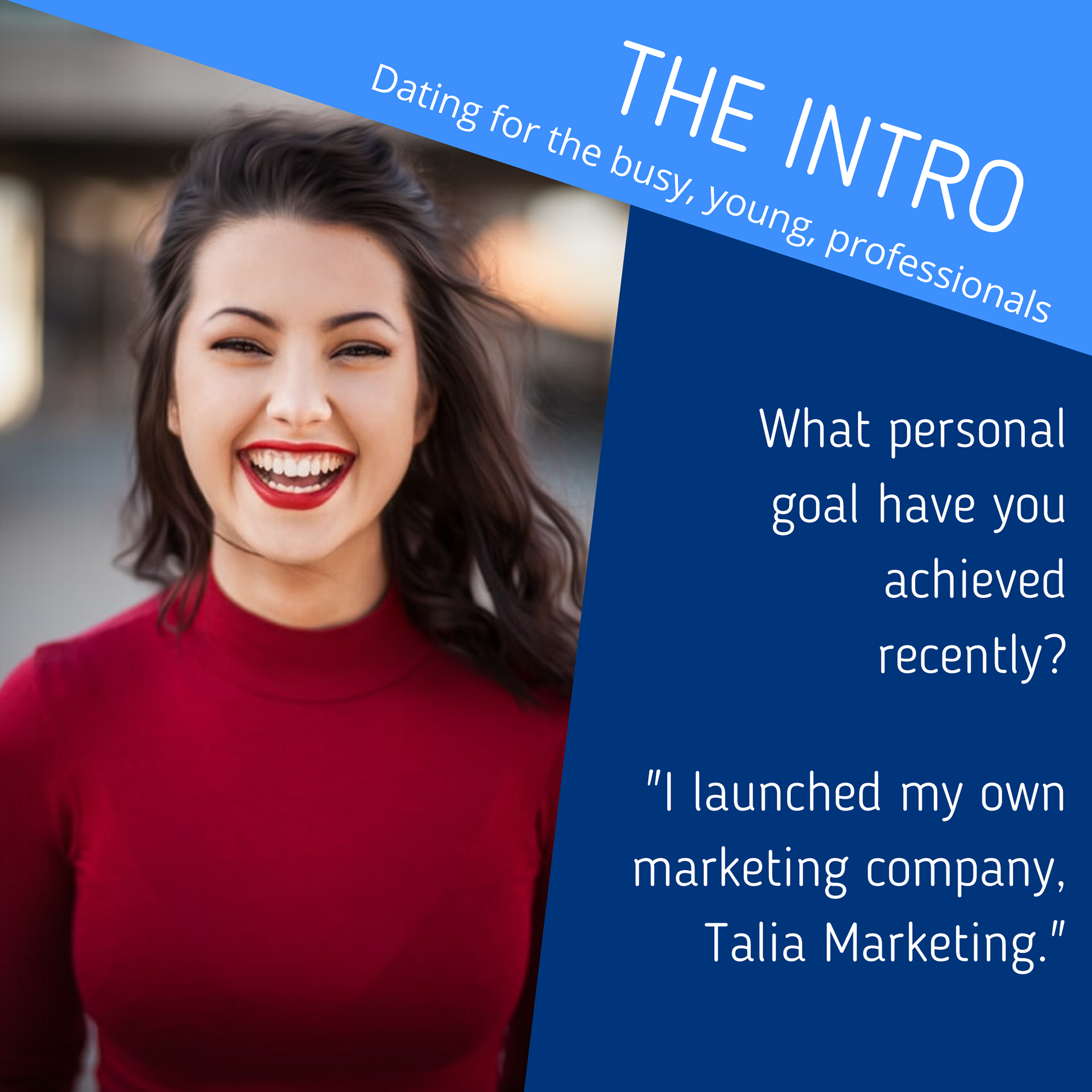
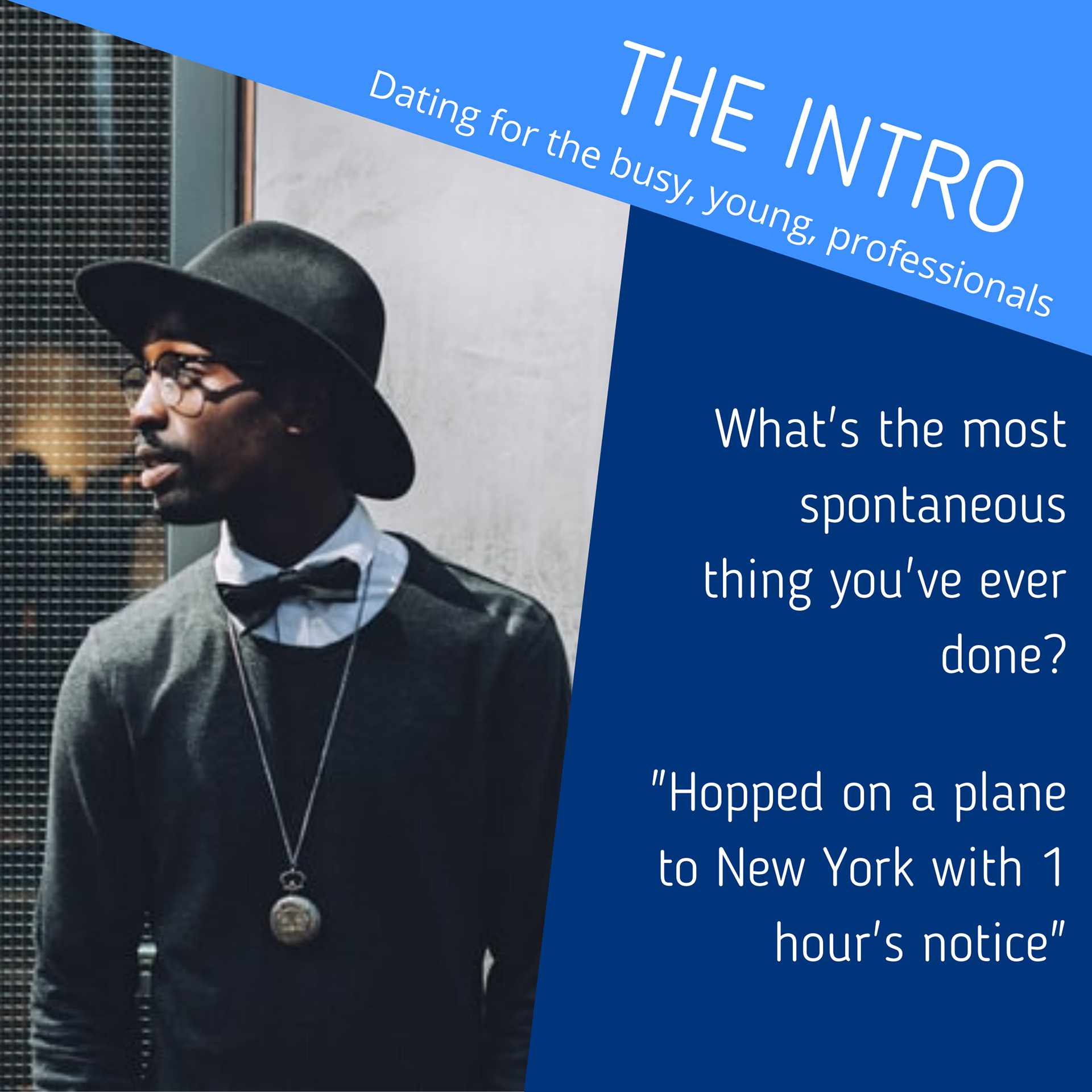
The posts were designed to highlight the professional aspect of the dating app, using the signature blue colour from the app itself, and applying modest and diverse imagery. I also used questions used in the app's Q&A section and kept a consistent theme throughout the posts with the geometric patterns, shapes and the font.